You should start making italics if you want people to buy your fonts.
Friendly advice,
2017
The Chicago Manual of Style (whose cover is set entirely in italic) prescribes the use of italic for emphasis, book and movie titles, names of music albums, paintings and ships, for foreign words or quotations of texts in foreign language, for references of a word, letter or number as itself, when introducing or defining technical terms, for algebraic symbols, physical quantities and mathemethical constants, and in numerous other situations. Following those rules it’s practically impossible to set any text of significant length without the use of italic, which means that any type family without italic styles can find use in situational display applications only.
It is easy for a person outside of Anglo-Saxon print tradition to overlook the imminence of italics in English language typography — the idea of "italic style" being an essential part of every font might seem really strange for an outsider. Initially, when the first italic print typeface appeared in the books published by Aldus Manutius around the year 1500, it was not meant as a supplement for the Roman character set, but as a self-sufficient body typeface of its own — a print imitation of fashionable at that time calligrpahic style. Script/calligraphic fonts are incredibly popular nowadays (for example, 15 out of 50 typefaces featured in MyFonts «Hot New Fonts» section are script typefaces) and 500 years ago the fashion was no different — the new style gained immediate popularity and began to spread even despite the fact, that the Venetian Senate granted Aldus exclusive right to use the italics. Once the new style was introduced, counterfeited italics started to be massively produced and used all over Europe (possibly, one of the earliest cases of massive copyright infringement). The use of italic to show emphasis in a text set in Roman type originated in the same 16th century and by the 17th century it became a clear norm. Also around that time the trend developed to present italic and Roman types as matching in the type specimen books. If you look at the situation nowadays, the established tradition implies the use of italic for almost every occasion, where any text highlighting is required. And even the Typographic Revolution would not dare to oppose this tradition:
1. In the first edition of the article this quote was mistakenly attributed to Jan Tschichold’s «New Typography» (where it is quoted). We apologize for this mistake. Thanks to Caluã Pataca for pointing it out.
Typographic Revolution
——————————————————————
I am starting a typographic revolution, directed above all against the idiotic, sick-making conception of the old-fashioned Poetry Book, with its hand-made paper, its sixteenth-century style, decorated with galleons, Minervas, Apollos, great initials, flourishes, and mythological vegetables, with clasps, mottoes, and Roman numerals. The book must be the futuristic expression of our futuristic thought. Better: my revolution is against among other things the so-called typographic harmony of the page, which is in complete opposition to the flow of style which the page allows. We will, if need be, use 3 or 4 different colours and 20 different typefaces on the same page. For example: Italic for a series of similar and swift sensations, Bold for the imitation of heavy tones, and so on. A new conception of the typographic/painterly page.
Filippo Marinetti1,
1919
It is strange, how Marinetti in his call for revolution against "the Poetry Book" doesn’t see any problem with italics. Somehow, Roman numerals are an issue, but the use of highly decorative imitation of a 16th century pretty handwriting is a futuristic expression, not part of the "typographic harmony" ensemble. It is even stranger, that he doesn’t address the application of italic itself, as his idea of highlighting the page with «3-4 colors and 20 different typefaces» is very close to how the use of italic is regulated in the Chicago Manual. The only difference is: where Marinetti suggests «20 different typefaces», Chicago suggests only one — italic. So, seemingly to achieve Marinetti’s idea all that is needed is to diversify the means of text highlighting. And it’s not like there are no alternative typographic traditions, which could be used to substitute the italic.
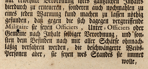
For example, while nowadays all foreign text is highlighted in italic, in the days of Latin as the international language of Europe often a different combination was used — Roman for Latin and blackletter for vernacular German:
In general, blackletter tradition offers a great variety of text highlighting techniques that don’t use italic (for an obvious reason — there is no italic in blackletter):

For example, a combination of two different blackletters may be used.
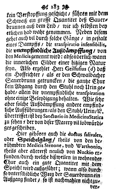
Or Bold styles can complement the "Regular".
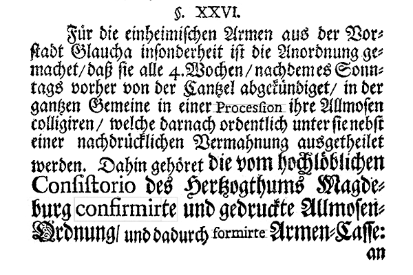
Sometimes you can find a mix of two different type sizes in one text (in this case, with a mix of two different sizes for Roman as well).

But probably the most common technique to encounter is the "sperrsatz" (wide letterspacing).
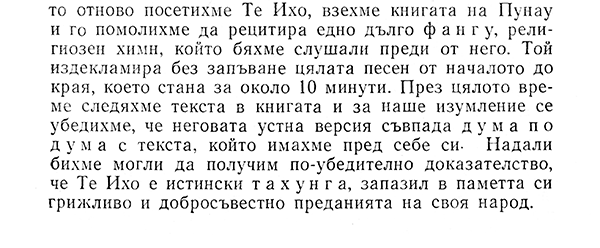
Sperrsatz is also a technique often to be found in Soviet publications (presumably, due to the fact that it was easier to space the type, than switching to a separate italic case).
So it is rather natural, that the designers of Bauhaus, coming from blackletter-dominant German typographic tradition, seem to be the first ones to start practicing italicless typesetting within modern Western typography. Their magazine, «Bauhaus» did not have any italics, but instead a variety of other techniques (rather similar to blackletter examples mentioned above) was applied:

In rare cases — underline.

Almost everywhere — sperrsatz.

Bold (often in combination with sperrsatz).
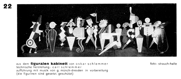
And even bigger type sizes were used.
It might be tempting to attribute the absence of italics in Bauhaus magazine to the unavailability of such styles at that time for sans serif fonts (which were mostly used in the magazine, even for longer texts), but actually italic grotesks were already quite common at that time and you can find italic sans serifs even in the 19th century specimens:
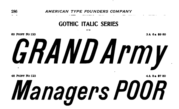
ATF Specimen, 1898
2. According to Bauhaus, «we write all lowercase, therefore saving time. besides: why 2 alphabets if one achieves the same? why write uppercase, if one can’t speak uppercase?» Even though we indeed don’t speak uppercase, the question of whether or not we speak italic can be argued.
I would like to think that Bauhaus designers did recognize the ridiculousness of the idea of adding a style, that imitates the handwriting, to the mechanistic typeface of the future — the grotesk (though, most likely their argument against italics was that of efficiency, rather than of aesthetics — probably, italics were avoided for the similar reasons as uppercase2). But why in further development of sans serif typography almost nobody seemed to continue the Bauhaus italicless tradition up until the digital revolution?
3. The term "true italics" is used to differentiate italic styles that use cursive lettershapes from oblique styles that use slanted versions of upright characters. For many reasons obliques can be still named "italic" in the font files (especially in the case of pre-OpenType font formats).
Sans serifs have italics nowadays just as often (read: always) as the serif typefaces, but for sans serifs often slanted (oblique) styles are used instead of true italics3. It is hard to say who exactly was the first one to come up with the idea, that slanted (oblique) would be more befitting for the neutrality of Swiss Modernism, but it is well possible that the trend was set by the most successful modernist sans serif — Helvetica. Helvetica’s oblique style instead of true italic makes perfect sense from a certain point of view — why would a typeface, that represents modernity and objectivity have a style, that imitates handwriting? Of course, slanted makes more sense. Though the bigger question is: why does a typeface, that represents modernity and objectivity is trying to imitate the calligraphic lean in at all?
There are a lot of arguments in favor of "true italics" and against the oblique/slanted styles. Especially the mechanically slanted fonts are disliked for their distorted outlines:
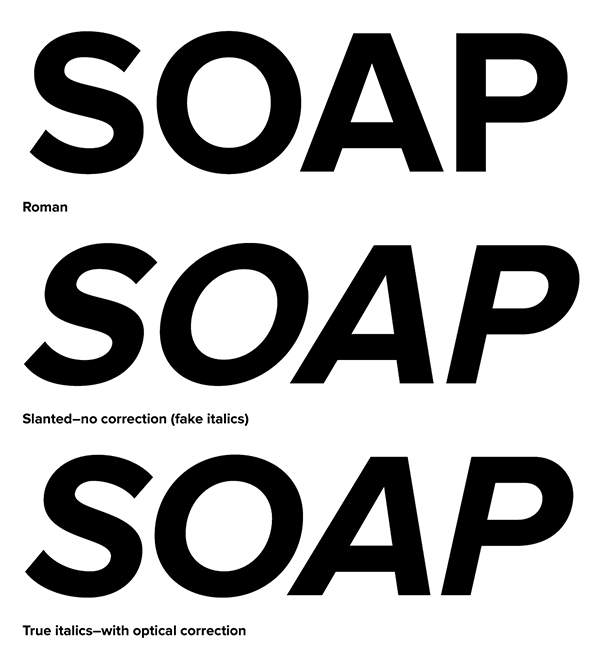
From Mark Simonsons’
«Fake vs. True Italics» article:
«Notice how the curves have become distorted. The subtle modulation of the stroke weight is thrown completely out of whack, getting thinner in some places and thicker in others. This is especially noticeable with the S, O and P. Notice how the O looks kind of squashed. The A is also affected, but the difference is less obvious: the left stroke has become slightly thinner while the right stroke has become slightly thicker.»
But wouldn’t exactly the mechanical distortion (and a noticable one) be most befitting for a modernist typeface, typeface of the machine world?
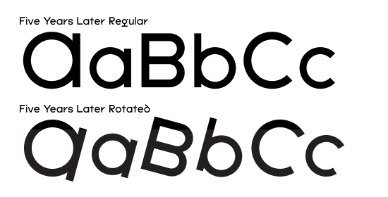
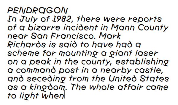
And what about geometric grotesks? Typefaces, whose design is entirely based on simple geometric shapes — circles, rectangles, triangles. What sense does it make to try to play off a slanted by eleven degrees oval as a basic geomteric shape? If anything, the logical solution for an italic style of geometric grotesk would be not a slant, but rotation. This was the thought behind the new "italic" style of
Five Years Later, FYL Rotated:
Rotation has a very interesting effect on Latin alphabet. In theory, rotating letters sound like a simple and natural thing to do, but you won’t find «Rotate characters» function in InDesign for a reason (and very, very rarely will you find a "rotated" typeface). Character rotation is unnatural for Latin typography, as it defies two fundamental concepts of Latin typesetting: the baseline and the intercharacter spacing system of a proportional typeface.
First, the baseline: if you decide to rotate the characters in a line of text, what should become the center of rotation? If you try to align the letters to the baseline by their lowest points, they would appear jumping up and down (depending on their widths) and even bigger problem would be dealing with ascenders and descenders (since, for example, the descender of "p" might not even touch the baseline). And how should the capitals be placed in relation to the lowercase in a rotated font? I would be lying to say that FYL Rotated provides any answers to these questions, as the characters are simply aligned by eye. The vertical alignment is based on what makes the best sense visually, but there is no system behind it.
Adjusting metrics/kerning of the rotated typeface is an even bigger issue: instead of usual exercise of solving the familiar spacing puzzle of vertical, oval and diagonal shapes (finding the optimal metrics to balance the character pairs like "nn", "no", "oo", "on", "nv", "vn", "ov", "vo", "vv", etc.), you are presented with innumerable amount of spacing combinations and the only good solution here is, probably, to go one step back and adapt the lettershapes themselves for the new rotated conditions. Maybe, it will be done one day, but for now FYL Rotated tries to fix the spacing issue with an uninventive bruteforce of 4462 (class-)kerning pairs.
I can imagine, that an English-language typographer is so rooted in the idea of italic that it’s hard to keep in mind, that other writing systems (in fact, the absolute majority of them) don’t even have the concept of italic. After all, we are all familiar with this iconic button trio:

. Will the italic button just not work on the Chinese text? Or will it just slant the text automatically, ignoring thousands of years of typographic tradition? Well, of course it will slant:
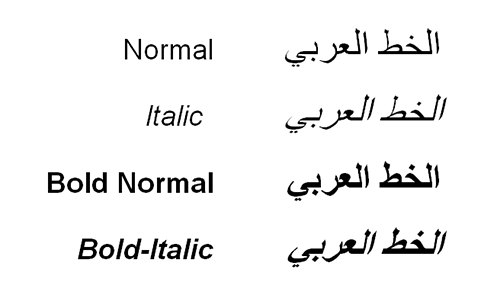
In the case of right-to-left writing systems (Arabic and Hebrew), this forced slant presents a curious question: in which direction should the text be slanted (considering that there is some reason to slant the text in the first place)?
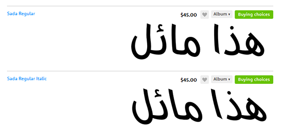
It is natural for italic text to lean forward. Which way is forward, though? In case of Arabic and Hebrew, "forward" is left, the opposite of Latin way, so the angle of Arabic Italic should be the opposite of Latin Italic.

Adobe Arabic, published by Adobe, leans right.

While Sada, published by Arabetics, leans left.
According to Wikipedia, «In the 1950s, Gholamhossein Mosahab invented the Iranic font style, a back-slanted italic form to go with the right-to-left direction of the script». It is a curious concept. Indeed, if we have a style that leans right, wouldn’t a style that leans left also be useful in some occasional worldwide applications? And apart from the whole Right-to-Left/Left-to-Right consideration, wouldn’t it be nice to have a greater variety of different italics just for purely aesthetic/expressive reasons? Maybe the Marinetti’s Revolution should be not mere «4 colors and 20 typefaces», but «4 colors and 20 typefaces with a dozen of different "italics" each»? For example, italic for emphasis and iranic for irony?
With these considerations in mind, four new styles were designed for
Panama: Monospace Italic, Monospace Iranic, Proportional Italic and Proportional Iranic (as in the case of straight cuts, proportional versions use the same outlines/letterforms as the monospace ones, only the spacing is different):
Also, a number of small adjustments was made in straight cuts of Panama:

"@" sign was changed.

Permille and permyriad signs were redesigned in monospace styles.

Zero sign is now dotted.

Infinity sign was redrawn.
If you previously bought any Panama fonts and would like to receive an updated version, please write an e-mail to
mail@temporarystate.net with your order number or a company name/email address.
Roman Gornitsky,
The Temporary State
26.03.2019


 . Will the italic button just not work on the Chinese text? Or will it just slant the text automatically, ignoring thousands of years of typographic tradition? Well, of course it will slant:

