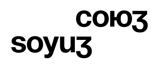
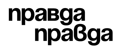
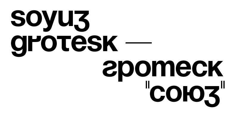
God only knows what all those janitors made of all that Swiss modernism. Moreover, Swiss modernism
is so dead that I’m not even sure what those twenty-somethings in the Vancouver audience 30 years later
made of it: probably they were wondering «Who is Emil Ruder and why is he ripping off Experimental
Jetset?» As for me, I was remembering — with no small amount of longing — those days when everything
seemed so clear. Working for Massimo Vignelli in 1980, I had no doubt whatsoever that the purpose of
graphic design was to improve the life of every person on earth beyond measure by exposing him or her
to Helvetica on a three-column grid. That was certainty, and it made design into a crusade.
Michael Bierut,
Graphic Design and the New Certainties, 2003
Indeed, for a New York designer in 1980 the Swiss Style must have seemed universal and omnipresent — the typographic
modernism was an already well-established practice with decades of history. In most other parts of the world, though,
the situation was largely different.
Even Greek typographers, despite their geographical vicinity, alphabet’s similarity, and strong cultural and economic
ties with the Latin world, didn’t have Helvetica until 1970s. And even seemingly exemplary project of Helvetica
Greek carried out on Linotype’s commision by renowned Matthew Carter, who did speak some Greek himself, received considerable criticism
for being 'too latinised'. Subsequent Linotype’s attempt on Cyrillic design was so awry that it had to be
completely discarded and redesigned from scratch in 1992 by Cyrillic native Jovica Veljovic.
Needless to say, that when it comes to non-Latin writing systems exercised in regions culturally and geographically
distant from Europe the opportunities for typographic modernism were even more slim: for example in 1957 — the year when Helvetica was
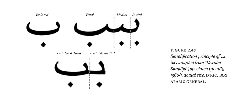
designed — Linotype was still trying to figure out how to adapt the forms of Arabic script to their machinery (and not the
other way around, of course), which resulted in 'Simplified Arabic' design.

An example of simplications made by Linotype.
Diagram from «Arabic Type-Making in the Machine Age» by Titus Nemeth, 2017
And even if there would have been resources and will to spread all the achievements of Latin modernism over to other
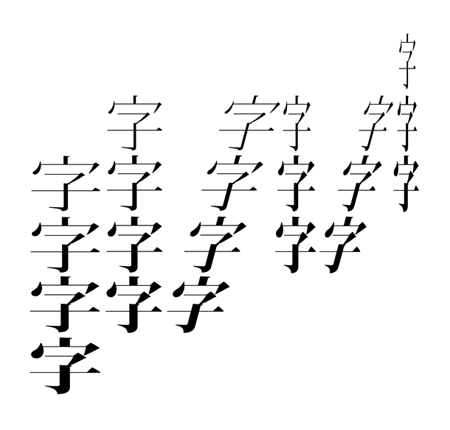
writing systems: how could for example the revolutionary idea of a 3-column grid be translated to Chinese — a system of
fully-justified monospaced script without any preferred direction of writing? And what would a Chinese typographer think
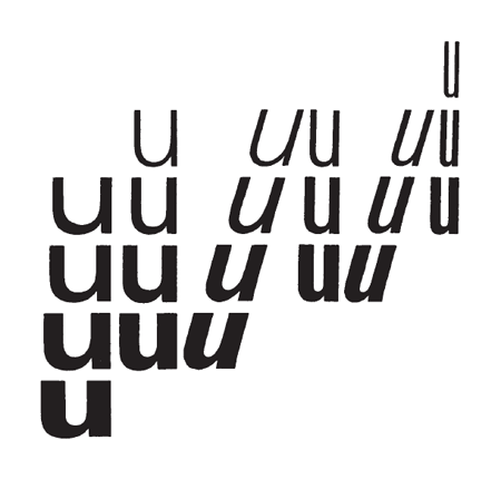
of Frutiger’s innovative Univers system when he has no use of either slanted styles or varied widths (except for maybe
very limited display purposes)?

The iconic diagram of 21 weights of Adrian Frutiger’s Univers from 1960...

...when translated to Chinese would present nothing but a strange arrangement of distorted characters.
The variety of vernacular scripts and national typographic traditions is an old enemy of typographic modernism.
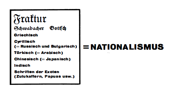
Already in 1928 Jan Tshichold, frustrated by the prominent use of Fraktur and unaware of any fundamental difference between
a typeface and an alphabet, wrote in his celebrated «New Typography»:
The emphatically national, exclusivist character of fraktur — but also of the
equivalent national scripts of other peoples, for example of the Russians or
the Chinese — contradicts present-day transnational bonds between people and forces
their inevitable elimination. To keep to these types is retrograde.
Latin alphabet is the international typeface of the future. These important
changes must come, since they express the actual spirit of our age and
are required by the technical forms of the present and indeed the future.
Jan Tschichold,
New Typography, 1928
While blackletter text typefaces are, indeed, on the brink of extinction, various national alphabets are feeling
better than ever: for example, Cyrillic nowadays has thousands of fonts (lots of them of the questionable quality, though),
making the possibilities for Cyrillic typographic expression almost equal to Latin.
But for Cyrillic that has not always been the case. A Soviet catalogue from 1983, for example, features a total of 17 typefaces
(only two of which are sans serif). Furthermore, in actual practice a print house would have a selection of two or three typefaces available (if
not even just one), which led to tremendous dominance of Literaturnaya in Soviet printed matter with over 70 percent of all books being printed in that typeface.
In addition to that, the government-set standards of book production — prescribing all the details from formats and margins to type
sizes — were greatly limiting the layout options. A seemingly simple task of convincing the publishing house to deviate from full justification prescribed
by the State All-Union Standard and flush the text left would require either extraordinary persuasion skills or blackmail. Moreover,
the printing houses were not too eager to deliver a product of finest quality. Margins and spacing were subject to huge deviations
and the typesetting itself was done half-heartedly to say the least (with lucky exceptions of printed matter produced abroad in Western
socialist countries, usually the case of multilingual yearbooks and catalogues).

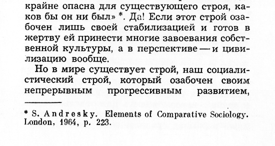
The text in this book is set in Zhurnalnaya, for which the printhouse probably didn’t have a Latin set. So the English
text on this page was set in Obyknovennaya Novaya.
«Nauka i chelovechestvo» (Science and Humanity), 1969

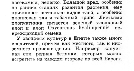
And a couple of pages later the Latin name of an insect is set in Literaturnaya in slightly bigger size than the rest of the text.
«Nauka i chelovechestvo» (Science and Humanity), 1969

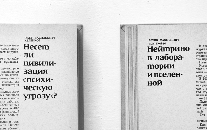
The attention to typography was minimal to say the least: even in this fancy publication by USSR Academy of Sciences
the authors’ names (capitalized text above the headers) are randomly set in two different typefaces — half in Akademicheskaya
and another half in Literaturnaya. Not to mention the variability of indents and margin sizes.
Nauka i chelovechestvo (Science and Humanity), 1963
This combination of layout stiffness and low-quality typesetting and production led to a widespread disregard among designers for the typography inside the book
(indeed, why bother when the results will be disastrous anyway?). Therefore, the cover design and the title page layout were worshipped as the only true forms of
artistic expression. The lack of print typefaces led to the prominent use
of hand-drawn fonts (with even small-size print on cover and title pages often being hand-drawn imitations of typesetting) and
a general interest for calligraphy and lettering — quite the opposite to Western modernism driven by mechanical typesetting.

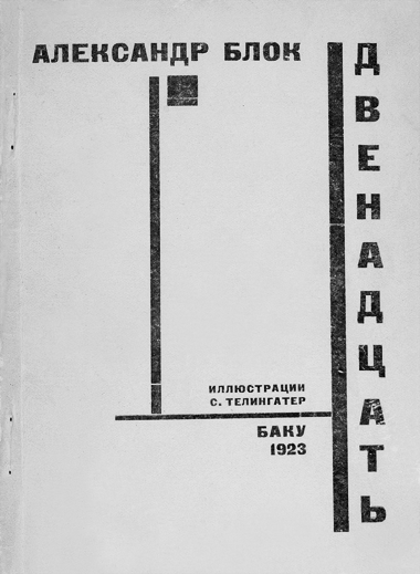
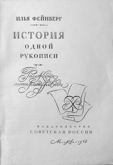
An entirely typographic book cover by Solomon Telingater from 1923...

...and his design 40 years later: a decorated calligraphic title page where even
what seems to be a print typeface is a handdrawn imitation.
As one can imagine, these circumstances were a far from perfect environment for the local rise of the International Typographic Style.
But some
of the younger generation of Soviet designers were eager to find a way to implement
the achievements of their Western colleagues and be able to set the text in 3-column Helvetica on Soviet soil despite all the obstacles.

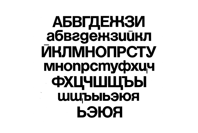
Type specimen.
Yuri Kurbatov and Maxim Zhukov, 1963
1. Yuri Kurbatov
(1931, Voronezh — 2002, Moscow)
Graphic designer. Studied in Institute of Physical Culture (1952-1956) and
Moscow Print Institute (1961-1966).
Designed books for various publishing houses (Znanie, Iskusstvo etc.). Worked for more than 20 years as a designer for Decorativnoe Iskusstvo SSSR (USSR Decorative Art) magazine.
Author of typefaces: Latinsky Bold (with M.Zhukov, 1962), Neue Haas Grotesk (Cyrillic, with M.Zhukov, 1963); Azbuka (1965); Lipsia (1970).
2. Maxim Zhukov
(b. 1943, Moscow)
A student of Solomon Telingater. Graduated Moscow Print Institute in 1965. Was working as a book designer since 1962
for various publishing houses — Iskusstvo, Mir, Znanie and others. In 1977-1981 and 1986-2003 was employed
as a typographic coordinator for the United Nations. Design consultant for Adobe, ITC, Linotype, Microsoft, Monotype,
ParaType, Font Bureau etc.
Author of typefaces: Latinsky Bold (with Y.Kurbatov, 1962), Neue Haas Grotesk (Cyrillic, with Y.Kurbatov, 1963);
Meandr (1972); Ideal, Rubin, Diplom (with V.Chaika, 1985).
Was teaching in Moscow Print Institute, British School of Art and Design (Moscow), The Cooper Union (New York),
Parsons School of Design (New York).
Organized «Typographica USSR» exhibition (New York, 1985) and type design competitions «Cyrillic’99» (1999) and «bukva:raz» (2001).
Member of the Board of ATypl, and the country delegate for Russia.
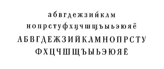
The first Cyrillic version of Helvetica was made in 1963. It was, in fact, a student project made by two Moscow Print Institute
classmates Yuri Kurbatov1 and Maxim Zhukov2. Young designers, captivated by the graphic design
of Ulm, Basel, Zurich and other centers of the modernist world, were looking for a tool that would allow them to do similar
typography in their own language — a Cyrillic Neue Haas Grotesk. And since Neue Haas Grotesk Cyrillic didn’t exist, a homemade bootleg copy
was made. In a very short time their creation became extremely popular, not only being used in books and magazines designed by
the typeface’s authors themselves, but also in designs of their friends and colleagues: Arkady Troyanker, Vasily Valerius, Mikhail
Anikst and other designers of Moscow’s new modernist wave of that time. This popularity was even more suprising, since most likely their creation
(let’s call it Sowjetische Haas Grotesk) was not a 'real' typeface, but a mere collection of letter 'cards' on transparent plastic for manual photocomposition.


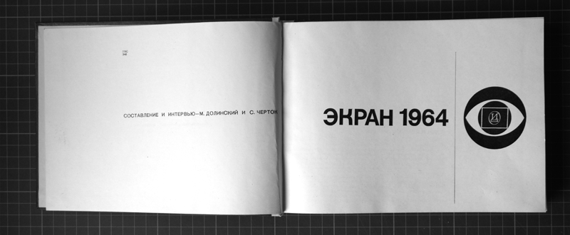
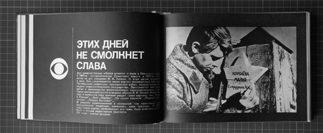
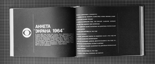
Another example: the typeface in use for a yearly publication about Soviet cinema, designed by another
student of the Moscow Print Institute V.Valerius.
«Ekran» (Screen), 1965


As usual, the typographic details are neglected: the book features two different solutions for quotation marks.
«Ekran» (Screen), 1965

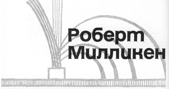
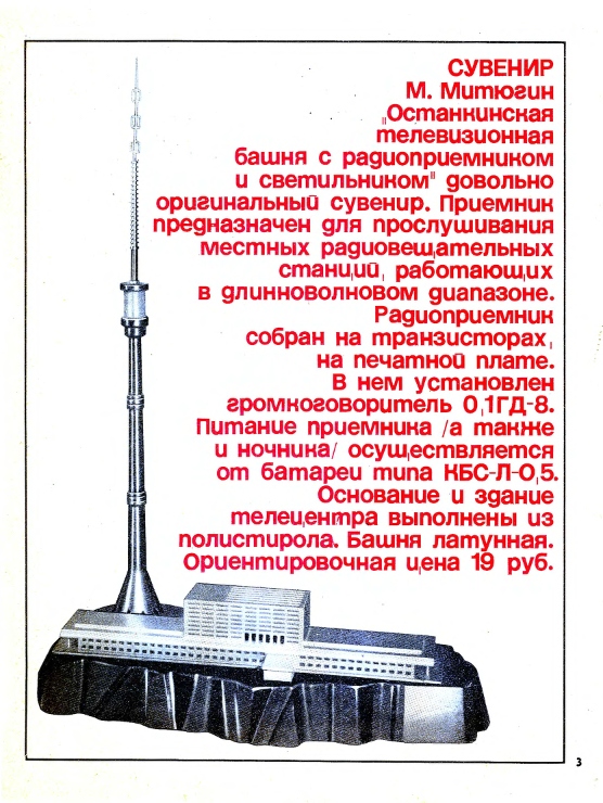
Even though the composition of this typeface was probably a very slow and tedious process,
the designers wouldn’t be stopped even by longer texts.
«Nowie Towary» (New Goods), 1968
3. From M.G.Rovensky’s «Memories from Poligrafmash Research Insitute’s Type Department»:
In 1918 the Print Department of the RSFSR Supreme Council of National Economy conducted the nationalization
of large and middle-sized print enterprises with the aim of centralization of production. The type industry
restitution did begin. A lot of printhouses had plenty of old, incomplete and morally obsolete typefaces.
In order to confine and organize the type assortment, the first type catalogue of the «Poligraph» trust was published in 1927.
The same year the Print Committee of the RSFSR Supreme Council of National Economy formed a board of foremost authorities
in the field of book art and type design [...] in order to create the first typeface standard. It was created in 1930.
Regulating the type industry, the first standard (OST 1337) lessened the burden of random eclectic
typefaces, preserved the non-ferrous metals, and introduced the new typefaces to typographic practice in order to raise
the quality of printed matter design. The standard included 14 typefaces for hand composition (31 styles). [...]
In 1930s the Production Department of the RSFSR Research Institute of People’s Commissariat of Local Industry did organize
a typeface group, which addressed the issues of history and development of print typefaces. [...] The Research Institute
of Print and Publishing Machinery of RSFSR Book and Magazine State Publishers’ Union also had a group of specialists. [...]
In 1938 the two type groups were united in the a type laboratory of the Print and Publishing Machinery Research Institute of RSFSR People’s Commissariat
of Local Industry. The type lab featured scientists, type artists, technicians, draftsmen, photographers and was the basis
for the future creation of the Department of New Typefaces. The systematic work to supply the publishers and print houses with
print typefaces had begun.
The newly created laboratory was given a task to finish the modernization of print typefaces, to conduct the addition of
characters of various national alphabets to the newly developed typefaces, to create original drawings of type sets based on the most
widespread foreign typefaces. With the accumulation of experience and theoretical research — to begin the development of
original domestic typefaces. [...]
The break out of war in 1941 interrupted the work of the laboratory. [...]
In March 1946 on the basis of the type laboratory of the Print and Publishing Machinery Research Institute of RSFSR People’s Commissariat
of Local Industry, the Department of the New Typefaces was established as part of the Research Institute of Print Machinery Manufacturing
(later renamed to Print Typefaces Department). [...]
The work of the Department of New Typefaces was exhibited in the most significant period of it’s development at the exhibition
«Modern print equipment. Inpoligraphmash-69», which was held in Moscow in 1969. Specially for this exhibition the «Typefaces of Print»
catalogue was published, featuring the specimen of 160 set-styles of typefaces in different sizes for typesetting in 144 languages of
the world — using both alphabets based on Russian or Latin graphic foundation and of special graphic forms (Armenian, Georgian, Arabic,
Persian, Hindi, Burmese etc.) — the result of the Department’s many years of work. [...]
Due to the development of new printing typesets and the evolution of machine typesetting the first print typefaces standard (OST 1337)
needed a revision. With the participation of the Department’s employees the standard was reviewed in 1951, 1957 and 1971. The last review
of the standard (GOST 3489.1-71. Print Typefaces) was developed in 1969-1971. GOST took in consideration all the typesetting methods
known to that day, including phototypesetting. The Standard included 37 typefaces of Russian and Latin graphic basis, intended for
typographic design of different printed matter. [...]
In 1970s the stagnation began to be manifested in the print industry. The funding of the creation of new print typefaces stopped.
Matrices factories stopped the deployment of new typefaces due to the lack of commissions, as printhouses contented themselves with
the minimum amount of typefaces, despite the Government Committee’s of Publishing, Printing and Book Trade orders about compulsory
typefaces assortment in printhouses.
Of course, this version of Helvetica was not commisioned (or authorized) and remained unknown for Linotype, since Linotype had very little
connection to the Soviet print market. Being unable to communicate with typeface’s original producer, in 1964 two designers did
make an attempt to develop their Helvetica into a 'real' typeface through NPO Poligrafmash’s Type Department3 and applied
for an internship there:
I remember to this day the harsh rebuff given to me and Kurbatov by comrades √ and ‡ (‡ is still alive), when in 1964
(hell, more than 30 years ago) we asked for the pre-graduation internship in hopes to get our — of course,
very amateurish — Helvetica Medium (known to us at that time as Neue Haas Grotesk) into shape at the premises of Type
Department. «It is a Western typeface of advertising kind, — we were told with a reproach, — absolutely nonapplicable in our context.
It won’t naturalize here». As a result, this «opinion» (remember: «There is an Opinion») not only postponed the development
of Cyrillic Helvetica for good two decades (I imply your bourgeouis advertising typeface «Pragmatica»), but also gave us
a truckload of different Helveticas designed abroad, none of which were entirely suitable for us.
Maxim Zhukov,
Letter to V.Efimov, 1995
4. An (incomplete) list of different Cyrillic helveticas:
— Pragmatica
(Paratype, 1989)
— Helvetica
(Linotype, first version
designed in 1970s,
redesigned in 1992)
— Helvetica Neue
(Linotype, 1998)
— Helvetica World
(Linotype, 2002)
— Vanta
(Intermicro, 1990)
— Helios
(TypeMarket, 1993)
— Cyrvetica
(SoftUnion, 1994)
— Helen
(HermesSoft, 2004)
— Ladoga
(MacCampus, 1990s)
— Letterica
(Tilde, 1991)
— Swiss 721 Cyrillic
(Bitstream, 1990s)
— Nimbus Sans
(URW++, 1999)
— Bastion
(DoubleAlex, 1992)
Indeed, Pragmatica (the most widespread and cyrillically 'correct' version of Helvetica) would come only in 1989 and
there will be dozens of other Helveticas appearing around that time, mostly developed by either Latin professionals unfamiliar with Cyrillics
or Cyrillic enthusiasts with little experience in type design.4 But none of these who came after would have
this unique flavour of naive enthusiasm, a truly modernist spirit of the typeface for the new world defying all previous
typographic tradition and conventions. In it’s vigorous naivety Sowjetische Haas Grotesk feels more modernist and radical
than the original Helvetica itself.

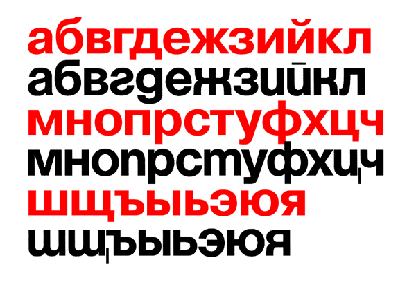
Pragmatica (red) character set compared to Sowjetische Haas Grotesk (black).
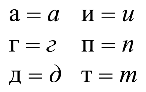
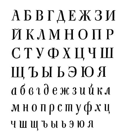
The shapes of the letters in Sowjetische Haas Grotesk are very different compared to Pragmatica (a very 'normal' typeface), to the extent
that almost half of the letters (in lowercase especially) have completely different constructions. How is that possible? First of all,
some of the shapes are actually upright cursive rather than regular upright. Cursive (and handwritten) letter shapes can be very
different from regular ones in Cyrillic and it was not too uncommon to try and utilize these cursive letter constructions, especially
for serif typefaces, to achieve a more 'Latin' look.

Some examples of regular and cursive letter shapes differences in Cyrillic.
According to Mr. Zhukov, though, (and it’s easy to believe) there is no connection between such developments and the ideas behind
Sowjetische Haas Grotesk:
It is not without reason that our [with Kurbatov] experiments with (or rather: on) Cyrillic lowercase were confined to Helvetica.
Helvetica (Neue Haas Grotesk, too) was 'our everything'; inexplicably (rather explicably, in fact) it somehow didn’t cross
our minds to try and 'improve' (latinize) Cyrillic serif in the same way. We didn’t see any connection between our experiments
and the attempt to 'straighten the cursive', made earlier by the designers of previous generations — for example, second half of
XIX century, with the works of Pozharsky, Kuzanyan, Krichevsky etc., not to speak of 'younglings of the Peter’s nest'.
Our motto was «Die neue Typographie»...
Maxim Zhukov,
Livejournal comment

Type specimen.
Pavel Kuzanyan, 1959

Final version of Kuzanyan’s typeface (note that most of the cursive shapes in lowercase are gone), 1966
And anyway, the 'upright cursive' part was only one of many interesting solutions implemented in this typeface. Another
notable trait is a naive, explicitly handdrawn style of some of the letters:
A style, which one might think isn’t really appropriate for Helvetica. But try to imagine Helvetica without it’s famous curvy R
or the small tail in a. In fact, there are some typeface projects that try to get rid of those details and helveticize Helvetica.
Without those little traces of handwork Helvetica miraculously loses most of it’s charm and becomes a very dull
typeface. Kurbatov and Zhukov’s strange Кк, Уу, б, etc. did the similar thing but with more intensity, simply because they were present
in a bigger portion of the character set and therefore were more prominent in typesetting.
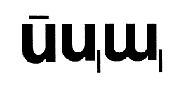
The final detail that needs to be mentioned is the decision for й, ц and щ — the use of very thin strokes, an element
that does not appear in Linotype’s original design at all:
The typeface was designed for a very tight typesetting and unsurprisignly the sticking to the right tails of ц and щ were a huge problem for typeface’s spacing.
The decision was made, amazing in it’s irrational brutality, to sever the tails from the letters’ bodies and transform them into thin lines,
use them almost as diacritics, creating a feeling of charming awkwardness.
Unfortuantely, this patchy compendium of letters was abandoned by the late 80s in favor of new helveticas (finally,
real typefaces that don’t need to be composed by handgluing) and unsurprisingly Sowjetische Haas Grotesk did not
survive to become a digital typeface — an unacceptable omission in the set of modern Cyrillic typefaces.
The most difficult task in the process of making a modern version of the typeface was the design of the Latin alphabet with the main
question being how to preserve all those weird decisions that appeared in the initial translation of Helvetica to Cyrillic
(or rather in adaptation of Cyrillic for Helvetica) and to translate it back to Latin. Obviously, the familiar shapes and letter constructions
of Linotype Helvetica were not fitting. The Latin part of the typeface should be designed as if the original Helvetica did never exist and with a healthy
disregard for the Latin alphabet heritage and tradition. Seeking a naive discovery, it should carry on the spirit of a typeface of the new order
for the new modernist world without history.
5. «As I see it, the traces of 'Bulgarian Cyrillic' lead to Leipzig, to the Hochschule für Grafik und Buchkunst of 1960s to be
specific. Almost all of the leading Bulgarian type- and book designers did study in Leipzig (for whatever reason none of them
wanted to study at the Moscow Print Institute). Broad nib pen calligraphy, taught by Kapr, Korger and others, was the sacred basis
of all type aesthethics in Germany of that time — both Western and Eastern. Hochschule students were studying it obligatorily —
no matter where they came from and regardless of peculiarities of their national writing systems. I remember a typeface designed by
Kapr’s Chinese student (if I remember correctly, named Freundschaft-Antiqua: it was featured in Kapr’s «Deutsche
Schriftkunst» book), — perfectly in the manner of «Calligraphic Old Style»...
Cyrillic was not working out too well for Kapr and Korger with their broad nib pen approach (expectedly so: it’s not an easy
task). And in general, it has too little ascenders, it’s annoying. I remember how he was telling Telingater discontentedly,
that 'Cyrillic problems' will be resolved when 'the problem of the letter я' will be resolved. So hochschulers obviously were encouraging
their Bulgarian students to 'latinize' Cyrillic script, patch it with more ascenders and descenders, etc.
It happened so, that lots of our Bulgarian colleagues saw in it a special 'our Bulgarian way' (different from Russian, just as
required), even though in practice it was inspired by our Leipzig colleagues. And when photo typesetting came to print in 1970s,
I remember how astonished I was when i saw a 'Bulgarized' Univers in one of the magazines printed in Sofia. Later I found out that
it was made on Bulgarian special order by Ladislas Mandel, who worked with Adrian Frutiger for many years. A couple of
years ago, when we met, he told me that he was surprised when in the year seventy-something he got an angry letter from me with the questions regarding this
project, as he thought that Bulgarians were talking on behalf of the entire Cyrillic community. What a twist.»
Maxim Zhukov,
Livejournal.com comment
One of many things that confuse Latin type designers when they face Cyrillic is the lack of ascenders and decenders
in lowercase. Russian alphabet, for example, has only four letters (out of 33) that have either
(nine if you count diacritics and little tails of д, ц and щ — still nothing close to 13 out of 26 in English), which
of course results in a totally different feel in typesetting. Often the solution to this Cyrillic 'problem' is to 'discover' letter constructions in which
some of the elements can be dragged outside the x-height: to employ cursive shapes for regular styles, as it was mentioned above,
or to redesign the existing letters — give к (and, as a result, ж) an unexpected Latin ascender, for example, or to employ handwritten shapes of в and з, so they would stick out. These
adjustments were especially common in Bulgarian typography, to the point that they resulted in the mutation of the alphabet
itself and gave birth to the so-called 'Bulgarian Cyrillic'.5

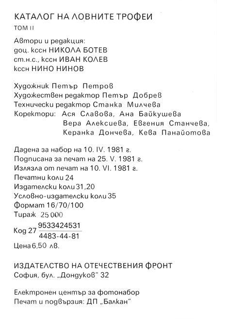
Example of 'Bulgarian Cyrillic'.
«Catalogue of Hunting Trophies for World Exhibition of Hunting», 1981
Sowjetische Haas Grotesk, as it was mentioned earlier, was not too eager to follow the Bulgarian path and utilize all these
gimmicks to achieve more latinized looks. As a result, the typesetting looks still rather 'Cyrillic' with a relatively little
number of elements outside the x-height. So in order for the Latin part to comply, the opposite move was made — the Latin alphabet
was stripped of it’s usual ascenders and descenders wherever possible.
Though, a necessary reference to the history of these Bulgarian developments was made. Cyrillic з and Latin z received a new shape
fit for both of them and the infamous Bulgarian в found it’s way into a separate stylistic set, where it serves as Latin b as well.
Lowercase Latin r is a repurposed Cyrillic ч, whose distinctive stroke composition wouldn’t be found in Latin alphabet otherwise.
Surprisingly, the original Sowjetische Haas Grotesk often had round period sign. This happened probably due to the fact that no
letters with dot diacritics were designed in the original set (Ukrainian alphabet probably was not taken in consideration and
ё, as it often happens, was probably omitted), so the need to make the dot squarish was not as obvious, as it is in
English with it’s constant presence of i and j. The round dots were preserved in the new typeface.

The thin strokes used in й, ц and щ are an essential part of this typeface design. In the typeface by Yuri Kurbatov and Maxim Zhukov
those thin strokes were also employed in a variety of punctuation: from quotation marks to unusually
thin hyphens and dashes and even commas (and those commas appearing next to the tails of ц and щ caused a lot of confusion). In Soyuz
Grotesk commas were given a less misleading shape, but a number of original thin punctuation was carried over. Similar thin lines are
now also used for various diacritics and in Cyrillic letter э.
Finally, the new typeface doesn’t have uppercase. First of all, in accordance with modernist ideas of kleinschreibung to abandon the uppercase
and therefore achieve more efficient, universal and rational typesetting. Second, in cosmopolitain effort to bring Cyrillic
and Latin closer to other scripts of the world, none of which (except for Armenian and Greek) have the concept of uppercase.

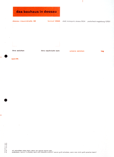
The text on the bottom of Bauhaus letterhead reads: «wir schreiben alles klein, denn wir sparen damit zeit.
außerdem: warum 2 alfabete, wenn eins dasselbe erreicht? warum großschreiben, wenn man nicht groß sprechen kann?»
(we write all lowercase, therefore saving time. besides: why 2 alphabets if one achieves the same? why write uppercase, if one can’t speak uppercase?).
Yuri Kurbatov and Maxim Zhukov — borrowing «The New Typography» motto from the Western modernism but operating in
a fundamentally different environment — gave birth to a curious tool that led to some rather interesting
and drastically different from Swiss Style typographic developments.
Soyuz Grotesk
is an attempt to offer a new point of view on the modernist legacy and to revaluate this heritage under the motto of «The New New Typography».
Since we recognize that the new typography is not possible without a universal access to typographic tools, the decision was made to distribute
the typeface for free. You can download it
here.
Yet, if you’d like to monetary support the cause you are welcome to do so by buying our merchandise: in November an
edition of sweatshirts will be printed with an adjusted Tschichold quote. An English language text is set in Cyrillic
and reads: «cyrillic alphabet is the international typeface of the future».
The sweatshirts are available for preorder
here.
Roman Gornitsky,
The Temporary State
19.10.2017
